
Designing Effective Presentation Materials
Visual aids can enhance a presentation by illustrating complex content, sometimes better than actually talking about it. However, visual aids can detract from an oral presentation if they do not support the message or are used inappropriately.
Depending on the type of presentation and delivery technologies available, you will have to select appropriate presentation tools or audio-visual aids to deliver your presentation.
The audio-visual aids in general can be presentation slides, audio (music, sounds, narration), video clips, real or scaled objects, etc.
The audio-visuals you select must be suitable for the size of the audience, room layout, lighting, sound system, etc. For example, in a large auditorium with an audience of several hundred people, showing a video clip with audio may not work well if there is no sound system.
You should have a good idea about the presentation set up from the preparation stage to select the appropriate audio-visual aids for delivery.
Did You Know?
People remember 65% of information from a visual and oral presentation, 35% from a visual presentation, and 10% from an oral-only presentation.
Audio-Visual Aid Design Principles
The following are general principles to remember in designing audio-visual aids:
Use Simple or No Background in Presentation Materials
Keep your presentation materials simple. Do not use complicated background designs that can distract from the content.
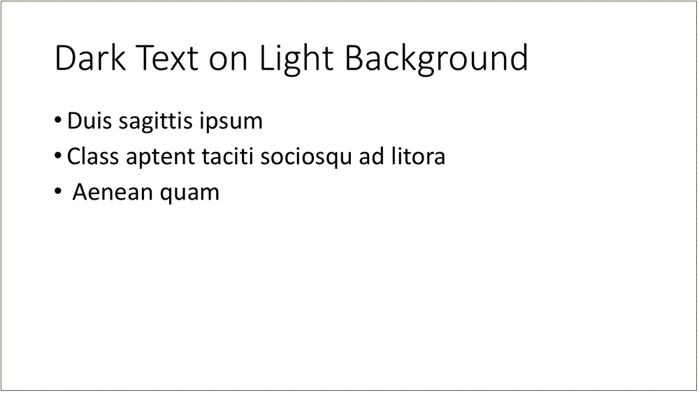
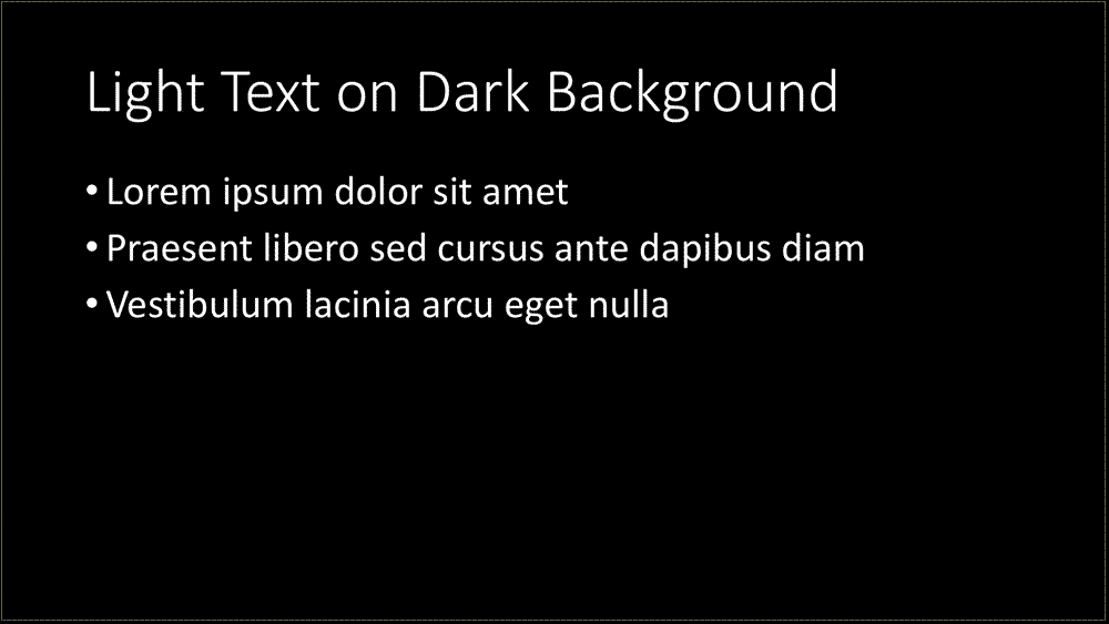
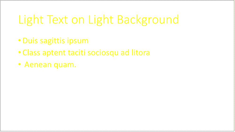
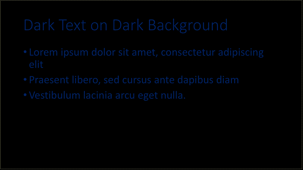
Use Colors That Provide Adequate Contrast and Make it Easier to Read
For example, use dark letters on a light background; and do not use light letters on a light background or dark letters on a dark background. It is better to use black or dark blue letters on a white background.
Slide With Light Background and Dark Text
Slide With Dark Background and Light Text
Slide With Light Background and Light Text
Slide With Dark Background and Dark Text
If colors used have meaning, remember that people with color blindness or visual impairment may not recognize the meaning.
Use Adequate Font Size That Allows Easy Reading of Text From the Last Row of the Room
Prepare a sample presentation screen, and see if you are able to view it from the last row of the room (if you know the location and have advance access to it).
Use Distinct Font Sizes for Titles and Section Headings
Use distinct font sizes for titles or section headings compared to points covered in those sections, and make sure they are consistent throughout. Turn off any "auto size" feature in presentation software to help with this.
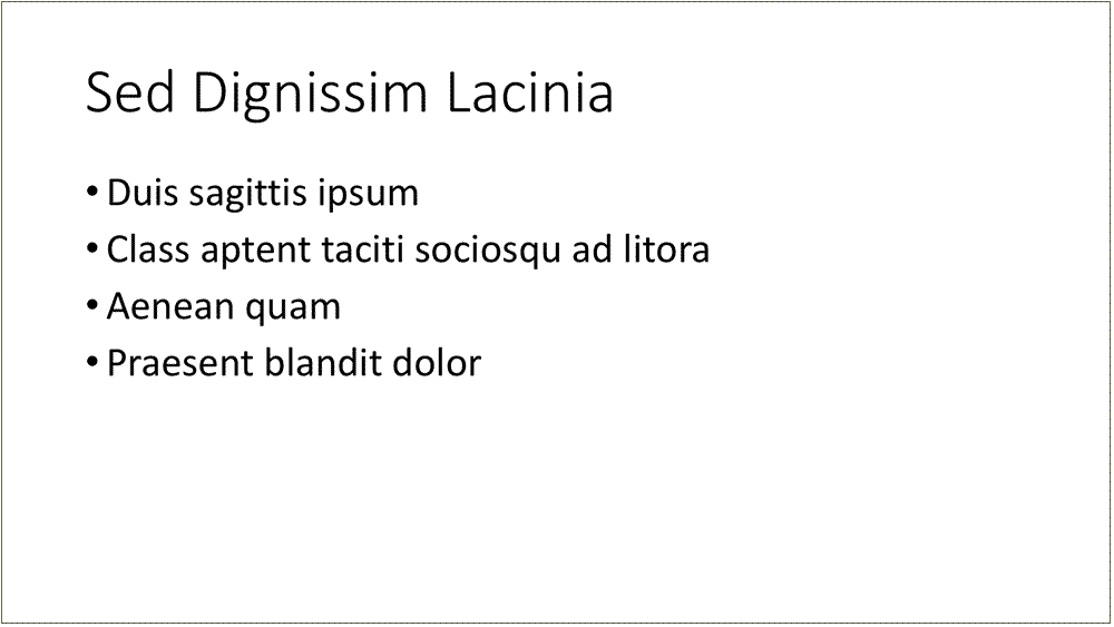
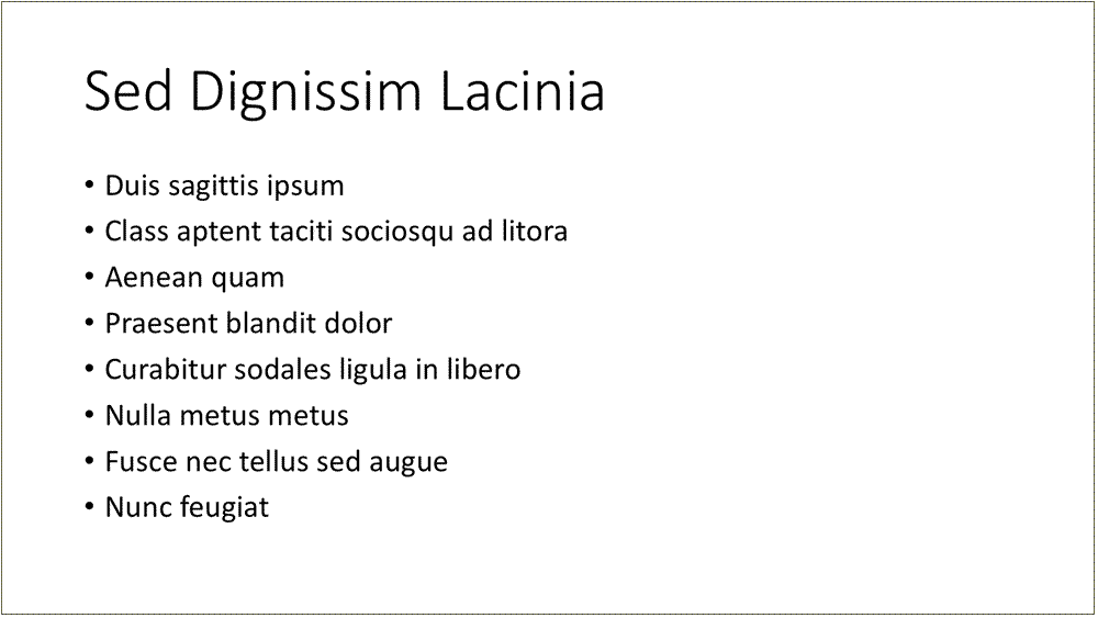
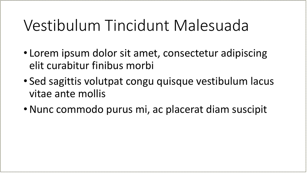
Limit Bullet Points to Four to Five Points per Slide, and Not More Than Seven Bullet Points
Slide With Four Bullets
Slide With More Than Seven Bullets
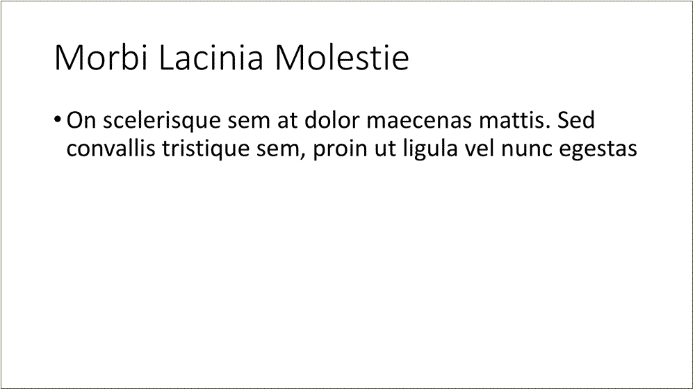
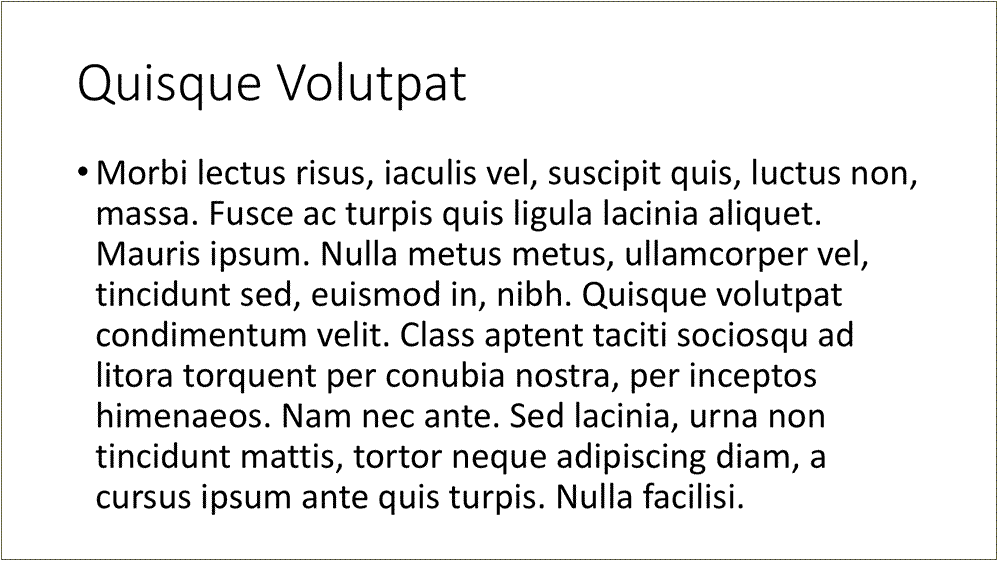
Limit each point to no more than two, or at most three, lines of text
Do not have whole paragraphs of text on the screen as the audience may not be able to read it.
Slide With Two Lines of Text
Slide With Many Lines of Text
Note that bullet points need not be complete sentences (unless it is a quote or a definition) and can be partial sentences or phrases.
Sample Slide With Bullets in Phrases

Sample Slide With Bullets Not in Sentences
Ensure Images Are Legible From the Last Row of the Room and Convey the Intended Content
If you have a large figure, show a high-level outline of the figure and then focus on the specific details of the figure on the following slide.
Ensure Animations or Transitions Don't Distract
When using animations or transitions in presentation materials, make sure they do not distract from the content and do not have a jarring effect, as some transition styles can cause seizures for people with certain disabilities.
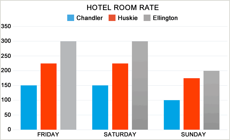
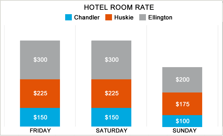
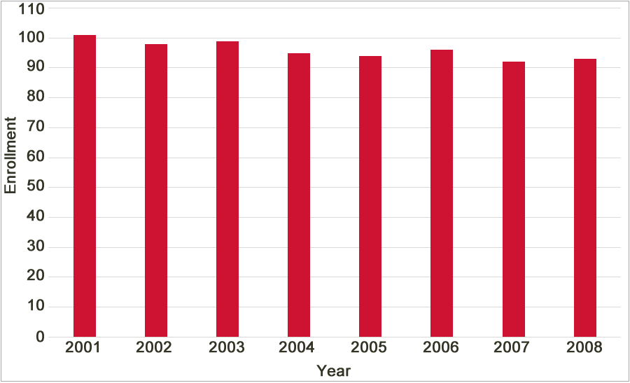
Ensure Chart Scales Don't Mislead
If you use graphs or charts in your presentation materials, make sure axis scales do not mislead the audience on the trends. Stacked bar graphs are also difficult for the audience to comprehend when you move through the slide quickly.
Sample Bar Chart
Stacked Bar Chart
Example graphs below show the same data in both charts but the first chart can mislead the audience about the data trend.
Chart Showing Misleading Trend
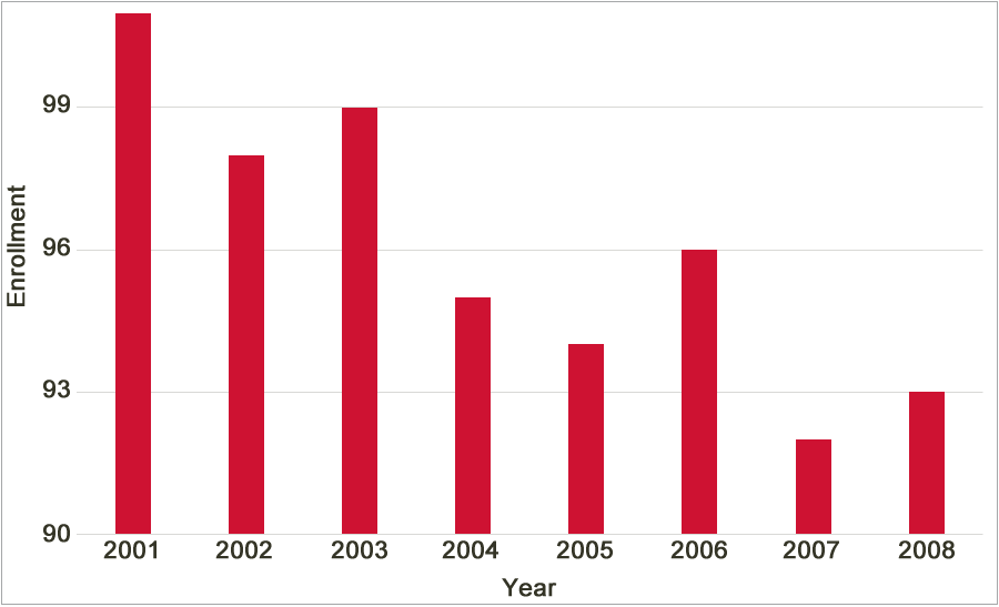
Chart Showing Realistic Trend
Show Video Clips at Easily Viewable Size
If you include video clips, make sure the size of the clip (¼, ½ or full size) on the screen is viewable for the audience.
Do Not Use Offensive or Stereotypical Visuals
If you use cartoons or animations or clip arts, make sure they are not offensive and do not stereotype people.
Play Audio at Easily Heard Levels
If you use audio clips, the sound system in the room should be adequate for the audience to hear.
Share Real or Scaled Objects at Easily Viewed Sizes
If you show real or scaled objects during your presentation, make sure they are viewable from the last row or use a document camera to display it.
Test Audio-Visual Aids in Advance
Test the audio-visual aids, especially if you use special plug-ins or players or different versions of software for display.
Design Your Audio-Visuals So All Members Can Experience Them
If you will have audience members with particular disabilities, then you will have to design the audio-visuals accordingly. Common disabilities may include color-blindness, visual impairment, hearing impairment, etc.
Proofread and Spell-Check
Proofread and spell-check presentation materials for grammar and spelling errors. Even minor errors will be glaring on a large screen!
When Using the Board or Flip Charts, Write Large Text and in a Logical Flow
If you plan to use the board or flip charts, learn to write in big letters or draw appropriately-sized figures so that the audience can view the information easily.
When writing on the board or flip charts, write from left to write and from top to bottom, so the audience can follow the logical flow of information.
Cite Sources Properly
If you include content from external sources in your presentation, include in-text citations where necessary and list the corresponding references at the end of the presentation materials.
Acknowledge Your Contributors
Acknowledge those who helped you with the presentation, including your team members, at the end of the presentation materials.
Remember Your Visuals Are To Enhance and Not Distract
Most importantly, design materials to enhance your presentation and help you deliver the content effectively, not to distract from it!

The Effective Presentation Skills Tutorial is licensed under a Creative Commons Attribution-NonCommercial-ShareAlike 4.0 International License.